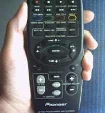
 In the last post, I showed two similar buttons that had different functions. Now, I'll present the opposite problem: two different buttons that have the same function. Picture 1 shows a remote control that is used to control both the TV and the satellite dish receiver.
At the bottom of the control, there are two sets of buttons to turn the volume. On the left-hand size, there is the TV volume control. It is gray and it is a half-moon-shaped. On the right-had side, there is the master volume control. It is black and round.
Both of them have the same function, which is to turn up/down the volume. Then you may think: "of course they are different colors and have different shapes. They control different gadgets." But I think it is unnecessary, because the buttons are well-separated. If two buttons have the same function, they should share the same symbols, colors and shapes to represent them.
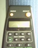
 At the top of the same remote control, they use a better solution: there are two red on/off buttons, one for the TV and another for the receiver. Both of them have the same shape and are the same color. The only difference is their size (see picture 2).
 At the top of the same remote control, they use a better solution: there are two red on/off buttons, one for the TV and another for the receiver. Both of them have the same shape and are the same color. The only difference is their size (see picture 2).
The factory which makes these remote controls should apply the same formula for both volume buttons and on/off buttons. The volume buttons should have the same shape and should be the same color, but they should differ in size.
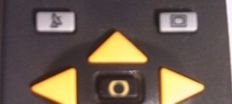
Another solution can be creating an extra button to select which gadget will be controlled. This way, they will need just one volume button and one on/off button. Picture 3 shows a control that was designed like that. The two gray buttons at the top are used to switch the control from the TV to the receiver and vice-versa.

No comments:
Post a Comment