Friday, October 06, 2006

Improving your multimedia presentations

I'm not an expert in presentations, but I have already watched a lot of them to know what is recommended to do when you are going to create a PowerPoint-like presentation. Below, I've listed some tips:
  1. Standardize the titles, subtitles, fonts, bullets, aligns and tables used in your presentation. All slides must follow the same standard.
  2. Create your own template. Avoid using the native design models from your presentation software, unless you want spectators to think you are a beginner.
  3. One of the first slides should bring the AGENDA, where you should introduce all presentation topics. Thus, the spectator will have an overview of the whole content that will be presented.
  4. Keep the spectator informed about where you are located in the whole content of the presentation. Show the titles and subtitles of each section in your slides. You can also use a kind of path on the header, like: recipes -> low fat -> desserts
  5. Keep the spectator informed about the amount of remaining slides. You can show the number of the current slide beside the total number of slides. It also would be nice to create a kind of progress bar in your presentation.
  6. Avoid showing texts. All textual information should be presented in topics using only keywords. Remember: the multimedia presentation is used for complement your speech. The spectators will not read long texts and you should never read them during your presentation.
  7. Use as many visual information as you can, such as images, photos and graphs. An image is more powerful than a thousand words.
  8. Let the content "breathe". Insert some spaces among slide elements. Your slide should be pleasant to the spectator's eyes.

Summarizing: make your presentation as different as you can from the presentation shown below.

A paper presentation by a D.Sc. author in a national conference
organized by Brazilian Computer Society

Sunday, July 02, 2006

Bad designs part VI

When I read texts for academicals purposes, I usually highlight its main clauses to help me to understand the gist. The picture shows the text markers that I use to highlight these texts. In fact, just two of them are really text markers. One of them is a regular ball pen. Looking at the picture, can you guess which pen is the ball pen?
When I want to use a text marker, every now and then I pick up the wrong marker in my cup that works as a pen rack.
The company prioritized a cool design instead of prioritizing the pen usability.
This post presents an example of things that have different functions but have similar packings.

Thursday, April 27, 2006

Bad designs: part V

The picture on the right shows a set of three displays in a gas pump. The top one shows the total cost of fuel, the middle display shows how many liters of fuel are pumped into one’s car, and the bottom one shows the price per liter of fuel.
Every time I fuel my car, I take a look at the central display and I think that the words “Total a Pagar” refer to the middle display. It takes a couple seconds until my brain understands the right boundaries of the information. Look at the picture. Does that happen to you too?

According to the principles of Gestalt psychology - a German theory that believes that we build into our minds a natural way of perceiving forms and patters, adding a kind of order unconsciously - we perceive the whole first, or the big picture, and then fit the parts into it.
I think it would be better if the words that describe each display were placed above them instead of below.
An alternative would be to keep more distance between the displays.

Tuesday, April 25, 2006

Bad designs: part IV


This time I present two computer keyboards that have one misplaced key.

In the first one, the place usually occupied by the space bar is divided in two. Then we have the backspace key on the left half and a shorter space bar on the right half (see picture above).

When I am typing a text in my computer, I usually hit the middle of the space bar with my thumb. Thus, when I am using that keyboard, the backspace key is frequently pressed too. When this mistake occurs, the letter previously typed is erased. Then, I waste time retyping it and pressing (in the right way) the space bar again.

In the second keyboard, the power key was placed right below the delete key (see picture below). As delete is one of the most frequently pressed keys on a keyboard, the risk of an inadvertent user pressing the power key is relatively big. When that happens, the computer starts the shutdown process. All my friends that have this keyboard model have already pressed the power key instead of the delete key at least once. Usually, after the second time they commit this mistake, they disable the power key in the computer setup.


Wednesday, April 19, 2006

Bad designs: part III

Last year, when I was traveling from Juiz de Fora to São Paulo on an old COMETA* bus, I took the following picture:

It shows an overhead console. Each seat has a console like that. The function of the black switches are to turn lights on/off. But what is the red switch for?
Firstly, I thought that it was a kind of “call button”. This kind of button is used to call the bus-attendant to come to my seat.
It also could be a button used to inform the driver that I want to get off the bus at the next bus stop.
In both cases, the switch should move back to the original position after it was pushed, otherwise the driver and his assistant would be warned uninterruptedly.
If my supposition is true, I’ve found the first design mistake: it should be a button instead of a switch.
As there was no attendant on the bus, and we were on a highway, I imagined that this red switch could have some other function. But what function could it have?
I wouldn’t try it unless I knew its function.
So, I convinced myself that this switch shouldn't be switched. I heard a mysterious voice in my mind: "don't press the red button!" That sounded like the right thing to do. After all, the color red usually represents danger. All red buttons that I know, such as the REC button on my VCR or the hang up button on my cell phone, should only be pressed if I’m sure about that. Otherwise, I can erase my favorite movie or finish an important call unexpectedly. Red buttons can also be used to launch nuclear missiles and start wars. So, the switch that is over my head may be an emergency break or an ejection seat button.
In the end, I agreed with the voice and I didn't try the switch. Does anyone know what that f**k switch is used for? Anyone?

* COMETA is the name of a traditional transportation company in Brazil. See picture below.

Tuesday, April 11, 2006

Bad designs: part II

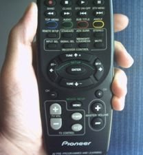
In the last post, I showed two similar buttons that had different functions. Now, I'll present the opposite problem: two different buttons that have the same function. Picture 1 shows a remote control that is used to control both the TV and the satellite dish receiver.
At the bottom of the control, there are two sets of buttons to turn the volume. On the left-hand size, there is the TV volume control. It is gray and it is a half-moon-shaped. On the right-had side, there is the master volume control. It is black and round.
Both of them have the same function, which is to turn up/down the volume. Then you may think: "of course they are different colors and have different shapes. They control different gadgets." But I think it is unnecessary, because the buttons are well-separated. If two buttons have the same function, they should share the same symbols, colors and shapes to represent them.

At the top of the same remote control, they use a better solution: there are two red on/off buttons, one for the TV and another for the receiver. Both of them have the same shape and are the same color. The only difference is their size (see picture 2).
The factory which makes these remote controls should apply the same formula for both volume buttons and on/off buttons. The volume buttons should have the same shape and should be the same color, but they should differ in size.
Another solution can be creating an extra button to select which gadget will be controlled. This way, they will need just one volume button and one on/off button. Picture 3 shows a control that was designed like that. The two gray buttons at the top are used to switch the control from the TV to the receiver and vice-versa.

Friday, April 07, 2006

Bad designs: part I


The picture shows my sister's hair dryer. It has two switches, one to control the rate of airflow and one to set its temperature. Mapping the switches, we have:

Switch #1:
0 - turn off / no airflow
I - lower speed fan
II - high airflow
Switch #2:
0 - normal temperature
I - warm
II - hot

Notice that both switches are too similar, they are the same size and the same shape, but they have different functions. Also there are no icons to make the switches different. Thus, the users have to remember their positions before using it.

I don't know about you, but I'm not good in memorizing things. So, when I'm using this hair dryer, I usually turn on the temperature switch first accidentally. But nothing happens, because it’s the wrong switch. Then, I turn on the other one and a hot powerful airflow strikes my hair. As I hate hot air, I have to turn off the previous switch quickly.

Using this hair dryer is always an adventure!

Friday, March 31, 2006

Bandwidth Speed Test Pages: Are they reliable?

There are a lot of bandwidth speed test pages on the web. Most of them are supported by internet providers and computer companies. But how do they work? Are the speed results reliable?

I think each one of them has its own method to accomplish the test. That can explain the differences among results. The server where each test page is hosted may influence it too. The differences among the results should be small, but it is not true.

Today I load two of these pages: Intel bandwidth test (www.intel.com/.../broadband/speedtest.htm) and RJNet speedometer (www.rjnet.com.br/velocimetro/teste100.asp). The results were very different, as shown below:


One hour after, I loaded the same pages again under the same conditions, i.e, no other softwares beyond the browser were opened in my computer. The following result was shown:


In both cases, the connection speed detected by RJNet test was more than 3 times higher than the speed detected by Intel page.
So, I decided to try a third page. This time, I loaded an international test at http://bandwidthplace.com/speedtest/. The result is shown below:


This result increased my doubts. On which test can we rely?

Wednesday, March 08, 2006

Top Keywords

Most of my friends don't have enough time to spend it reading this blog. So, I don’t expect that my posts will be read by them or by any other visitor. Even so, depending on the words used in my texts, this page can be reached through search results of sites like Google or Yahoo.
Thus, in the hope of attract new visitors, I looked for the top search terms used in web searches and I put them in this post.

One of the top search term used is the word "sex". If I combine it with related keywords like teen, tits, girls, nude, lesbian, breasts or voyeur, maybe a lot of perverted adolescents will find my blog. Famous girls like Pamela Anderson, Britney Spears, Angelina Jolie and Jennifer Lopez also have thousands of searches every month. So, if a boy type "Britney Spears Nude" in a search engine, there is a chance this page will be reached.

But if I want to attract women to my blog, I should write terms such as: “baby names”, “hair styles” “Horoscopes” and “George Clooney”.

Also there are those keywords that are ever in vogue: free, download, eBay, dogs, music, lyrics, anime and games. Nowadays, Oscar, Lost, Viagra, bomb and hurricane Katrina should be the top searched terms.

Maybe the strategy of writing just once each top keyword is not enough to highlight this blog in search results' pages. Therefore, many sites use the follow cheat: (select the lines bellow)
Oscar Lost Viagra bomb anime games dogs free download eBay photos music lyric Mapquest Pamela Anderson Britney Spears Angelina Jolie Jennifer Lopez Paris Hilton George Clooney teen girls nude sex lesbian sex Hairstyles, hair styles baby names Horoscopes
I’m not sure if it will work. Let’s wait a couple of days and try some searches on Google. Probably this strategy will not work, because no page links to this blog (the Google mechanism also takes into account the amount of links from other pages that point out to my page).

If you are interest in learning more about the top search terms, check these sites:
http://buzz.yahoo.com/overall/
http://searchenginewatch.com/searchday/article.php/3573491
http://www.nielsen-netratings.com/pr/pr_060118.pdf

Tuesday, March 07, 2006

Hello World

I have never liked personal blogs, specially those that works as an on-line diary, where people publish things like: "today I have taken my dog to vet" or "my nephew was born yesterday". I think all that is so boring. But it can be very useful if you are in love with some blogger girl. In this case, you can read her blog (and/or her Orkut page) to learn more about her preferences and habits, and use this information to try to conquer her. Maybe it is the aim of many bloggers: supply clues about themselves to someone who may be interested in them.

I’ve realized that Fotologs are better for that purpose. These illustrated blogs are playing the role of electronic personal diaries, while the traditional blogs have become more “institutional”.
Yesterday I read an interview with David Sifry, the founder of Technorati – the first blog’s search engine on the web (http://www.technorati.com). The interview was entitled: “One day, everybody will have a blog”. Sifry speaks about how blogs are helping customers’ relationship with several corporations. Besides, blogs are a new democratic channel, where everyone can publish their opinion. Blogs of professionals, like journalists, lawyers, researchers, politicians and CEOs can be very influential nowadays.

I don’t know if David Sifry is right and one day, everybody will have a blog. At least, I’m doing my part creating this Blog. But my objective is not to reveal things about myself and make my life public; I just want to use this page to improve my English writing skill.