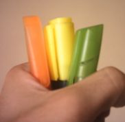
 When I read texts for academicals purposes, I usually highlight its main clauses to help me to understand the gist. The picture shows the text markers that I use to highlight these texts. In fact, just two of them are really text markers. One of them is a regular ball pen. Looking at the picture, can you guess which pen is the ball pen?
When I want to use a text marker, every now and then I pick up the wrong marker in my cup that works as a pen rack.
The company prioritized a cool design instead of prioritizing the pen usability.
This post presents an example of things that have different functions but have similar packings.
