Thursday, April 27, 2006

Bad designs: part V

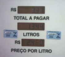
The picture on the right shows a set of three displays in a gas pump. The top one shows the total cost of fuel, the middle display shows how many liters of fuel are pumped into one’s car, and the bottom one shows the price per liter of fuel.
Every time I fuel my car, I take a look at the central display and I think that the words “Total a Pagar” refer to the middle display. It takes a couple seconds until my brain understands the right boundaries of the information. Look at the picture. Does that happen to you too?

According to the principles of Gestalt psychology - a German theory that believes that we build into our minds a natural way of perceiving forms and patters, adding a kind of order unconsciously - we perceive the whole first, or the big picture, and then fit the parts into it.
I think it would be better if the words that describe each display were placed above them instead of below.
An alternative would be to keep more distance between the displays.

Tuesday, April 25, 2006

Bad designs: part IV


This time I present two computer keyboards that have one misplaced key.

In the first one, the place usually occupied by the space bar is divided in two. Then we have the backspace key on the left half and a shorter space bar on the right half (see picture above).

When I am typing a text in my computer, I usually hit the middle of the space bar with my thumb. Thus, when I am using that keyboard, the backspace key is frequently pressed too. When this mistake occurs, the letter previously typed is erased. Then, I waste time retyping it and pressing (in the right way) the space bar again.

In the second keyboard, the power key was placed right below the delete key (see picture below). As delete is one of the most frequently pressed keys on a keyboard, the risk of an inadvertent user pressing the power key is relatively big. When that happens, the computer starts the shutdown process. All my friends that have this keyboard model have already pressed the power key instead of the delete key at least once. Usually, after the second time they commit this mistake, they disable the power key in the computer setup.


Wednesday, April 19, 2006

Bad designs: part III

Last year, when I was traveling from Juiz de Fora to São Paulo on an old COMETA* bus, I took the following picture:

It shows an overhead console. Each seat has a console like that. The function of the black switches are to turn lights on/off. But what is the red switch for?
Firstly, I thought that it was a kind of “call button”. This kind of button is used to call the bus-attendant to come to my seat.
It also could be a button used to inform the driver that I want to get off the bus at the next bus stop.
In both cases, the switch should move back to the original position after it was pushed, otherwise the driver and his assistant would be warned uninterruptedly.
If my supposition is true, I’ve found the first design mistake: it should be a button instead of a switch.
As there was no attendant on the bus, and we were on a highway, I imagined that this red switch could have some other function. But what function could it have?
I wouldn’t try it unless I knew its function.
So, I convinced myself that this switch shouldn't be switched. I heard a mysterious voice in my mind: "don't press the red button!" That sounded like the right thing to do. After all, the color red usually represents danger. All red buttons that I know, such as the REC button on my VCR or the hang up button on my cell phone, should only be pressed if I’m sure about that. Otherwise, I can erase my favorite movie or finish an important call unexpectedly. Red buttons can also be used to launch nuclear missiles and start wars. So, the switch that is over my head may be an emergency break or an ejection seat button.
In the end, I agreed with the voice and I didn't try the switch. Does anyone know what that f**k switch is used for? Anyone?

* COMETA is the name of a traditional transportation company in Brazil. See picture below.

Tuesday, April 11, 2006

Bad designs: part II

In the last post, I showed two similar buttons that had different functions. Now, I'll present the opposite problem: two different buttons that have the same function. Picture 1 shows a remote control that is used to control both the TV and the satellite dish receiver.
At the bottom of the control, there are two sets of buttons to turn the volume. On the left-hand size, there is the TV volume control. It is gray and it is a half-moon-shaped. On the right-had side, there is the master volume control. It is black and round.
Both of them have the same function, which is to turn up/down the volume. Then you may think: "of course they are different colors and have different shapes. They control different gadgets." But I think it is unnecessary, because the buttons are well-separated. If two buttons have the same function, they should share the same symbols, colors and shapes to represent them.

At the top of the same remote control, they use a better solution: there are two red on/off buttons, one for the TV and another for the receiver. Both of them have the same shape and are the same color. The only difference is their size (see picture 2).
The factory which makes these remote controls should apply the same formula for both volume buttons and on/off buttons. The volume buttons should have the same shape and should be the same color, but they should differ in size.
Another solution can be creating an extra button to select which gadget will be controlled. This way, they will need just one volume button and one on/off button. Picture 3 shows a control that was designed like that. The two gray buttons at the top are used to switch the control from the TV to the receiver and vice-versa.

Friday, April 07, 2006

Bad designs: part I


The picture shows my sister's hair dryer. It has two switches, one to control the rate of airflow and one to set its temperature. Mapping the switches, we have:

Switch #1:
0 - turn off / no airflow
I - lower speed fan
II - high airflow
Switch #2:
0 - normal temperature
I - warm
II - hot

Notice that both switches are too similar, they are the same size and the same shape, but they have different functions. Also there are no icons to make the switches different. Thus, the users have to remember their positions before using it.

I don't know about you, but I'm not good in memorizing things. So, when I'm using this hair dryer, I usually turn on the temperature switch first accidentally. But nothing happens, because it’s the wrong switch. Then, I turn on the other one and a hot powerful airflow strikes my hair. As I hate hot air, I have to turn off the previous switch quickly.

Using this hair dryer is always an adventure!